Rarebase

Year
/ 23
Client
Rarebase
Service
Design System
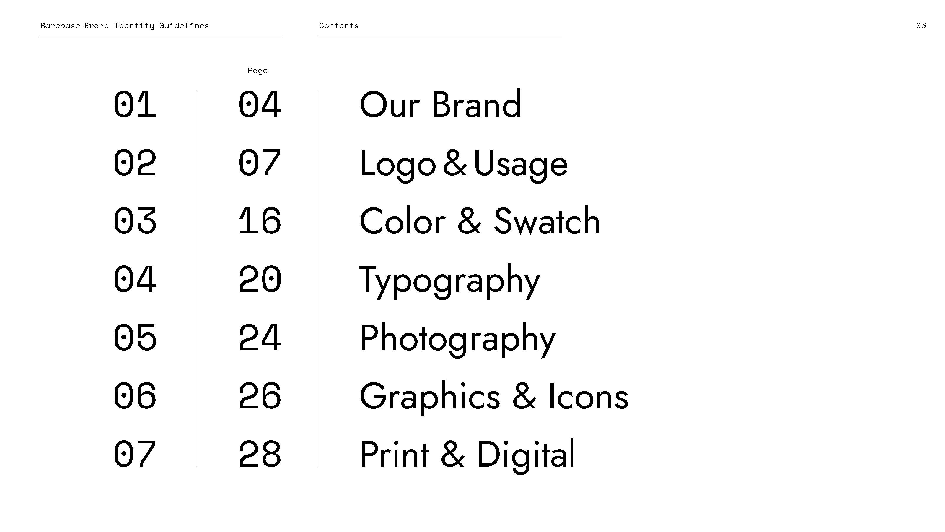
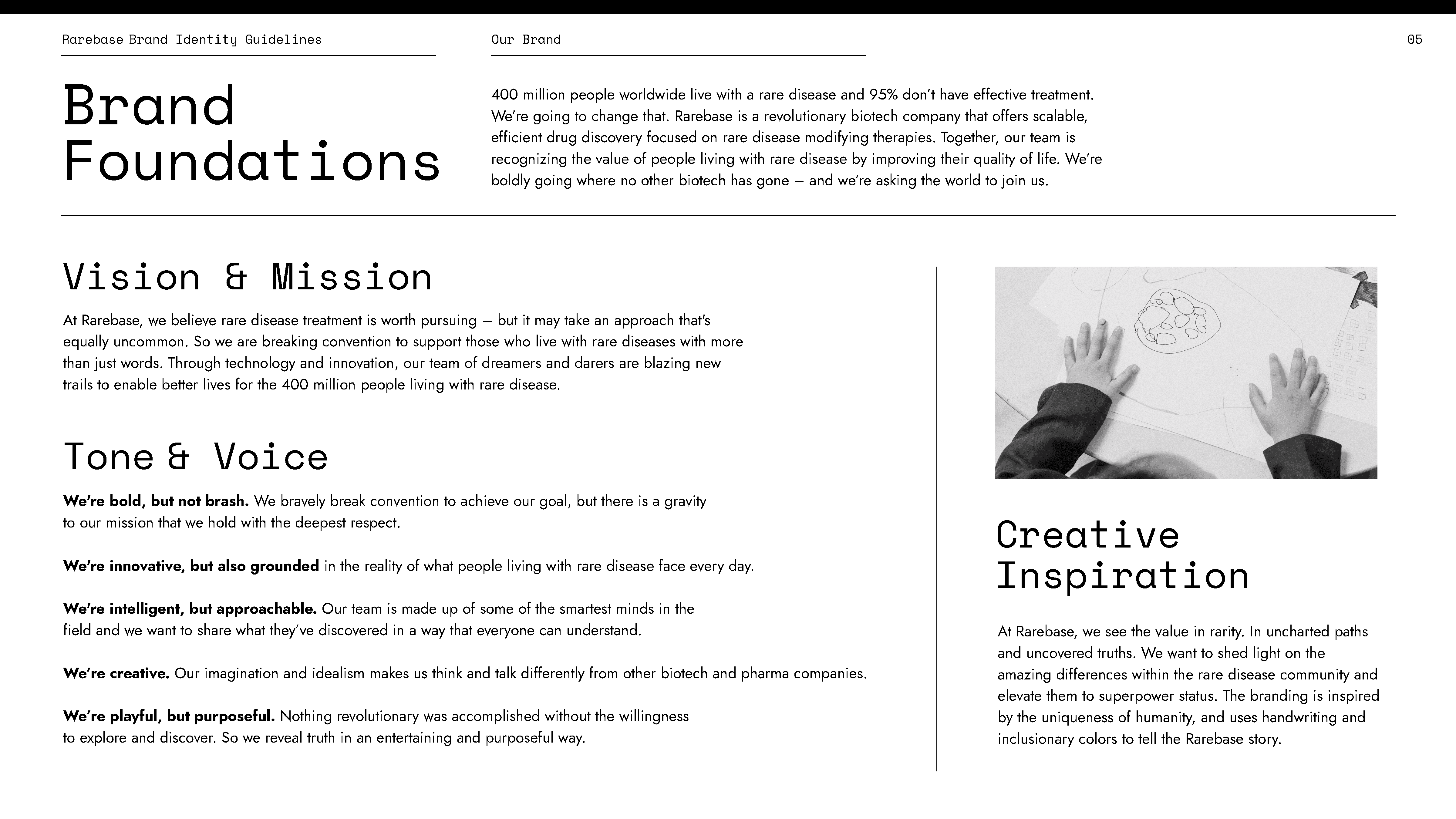
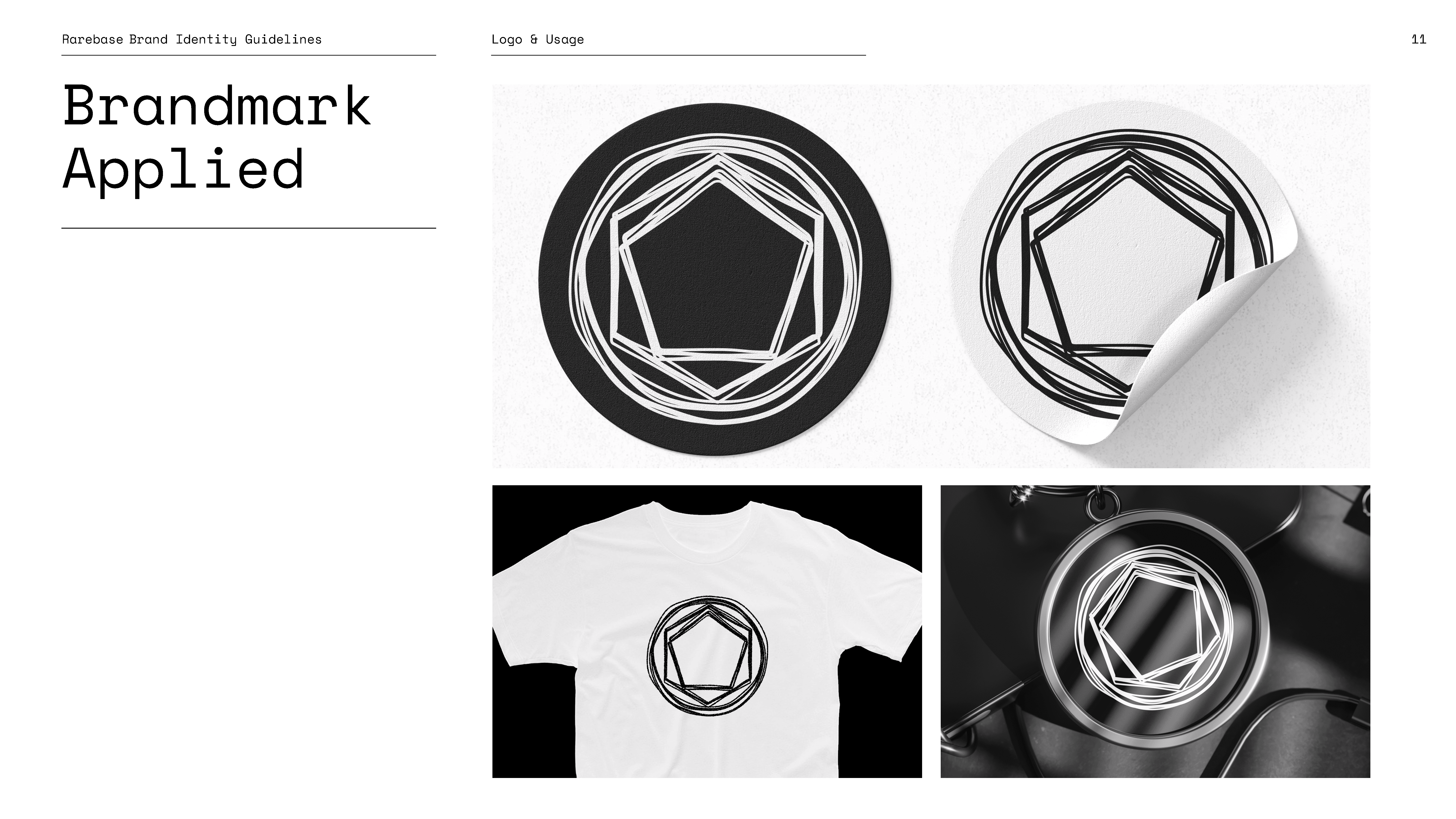
Rarebase exists at the frontier of medical discovery-where families search for answers and researchers race against time. Our task was to build a design system that could carry the weight of both scientific precision and human hope. This wasn't about branding a product; it was about creating a visual language for possibility. The Rarebase system needed to make complex research approachable without diluting its rigor, to reassure while also inspiring, to serve as both microscope and megaphone.
© Rarebase















Challenge
The challenge was clear: how do you translate high-level biotech research into a visual identity that feels trustworthy to scientists and understandable to everyday families? How do you speak to hope without oversimplifying the science?
Solution
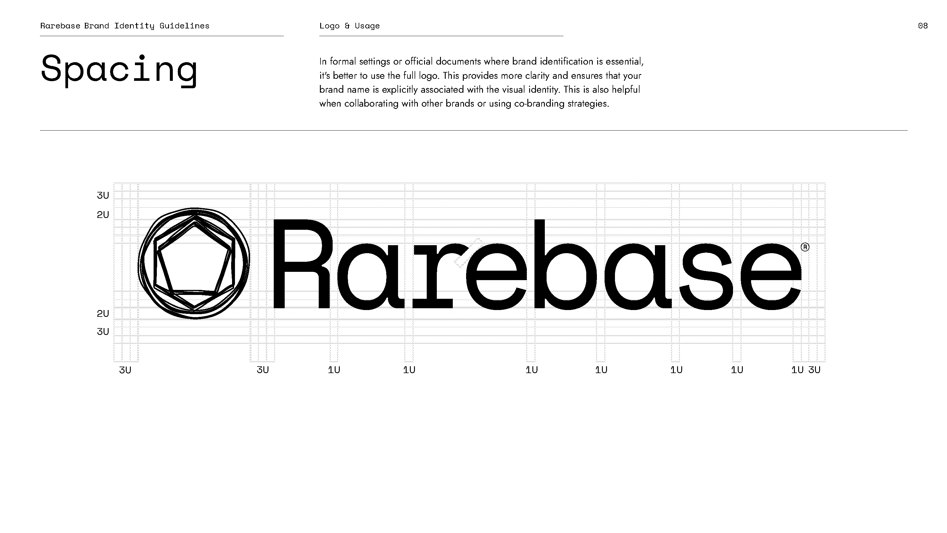
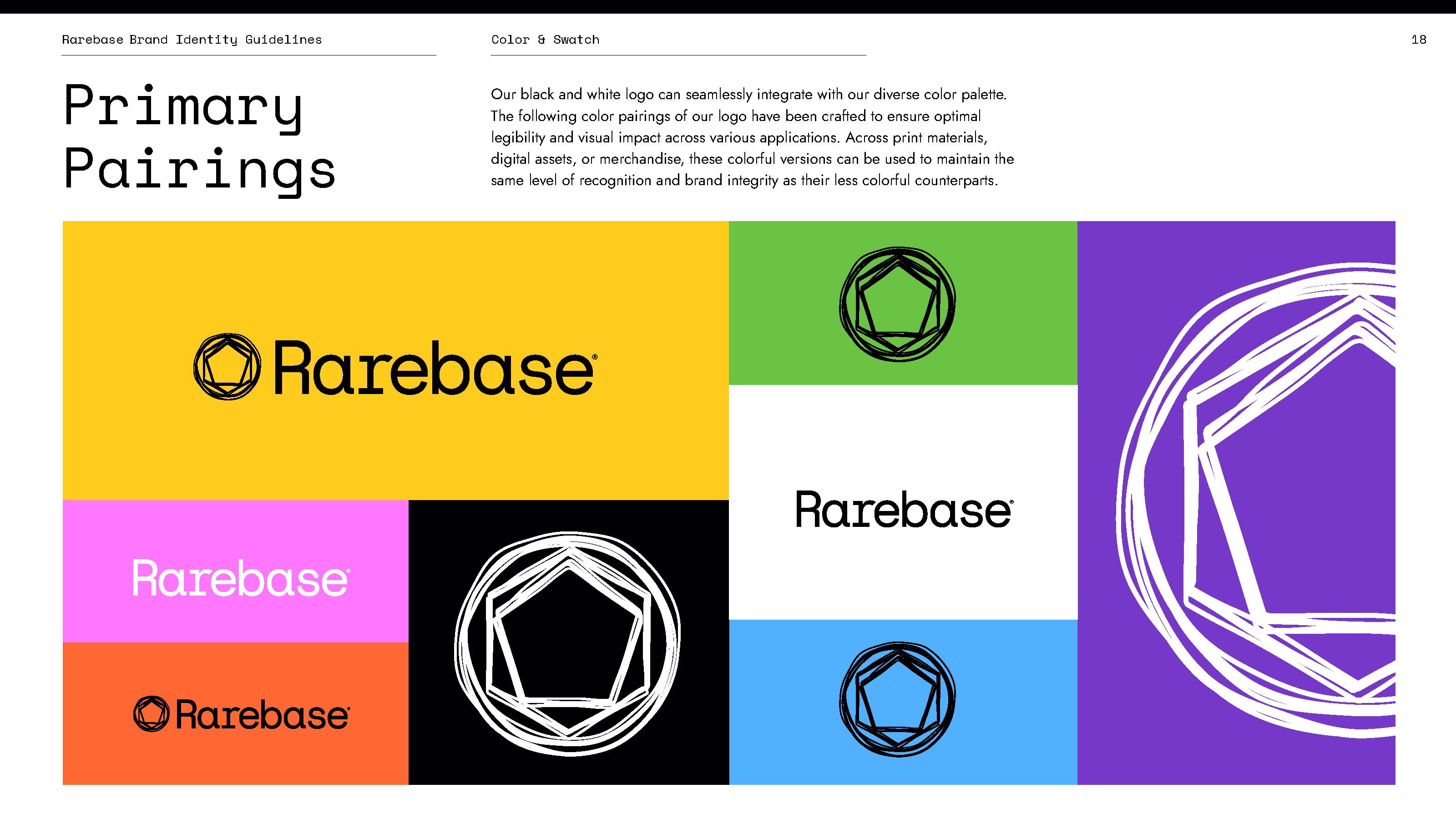
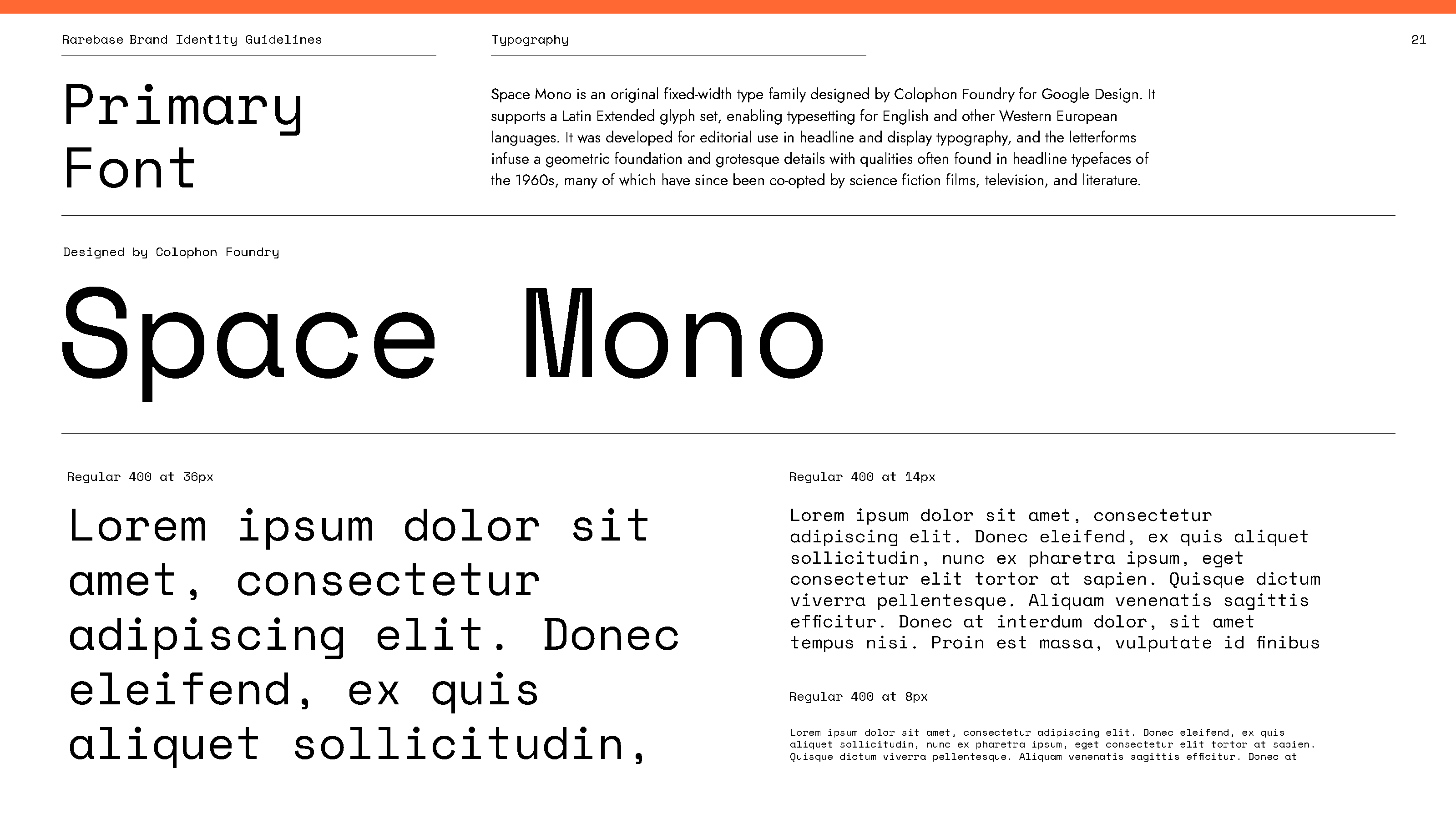
We built a modular design system rooted in clarity, scale, and adaptability. At its core is a typographic hierarchy that elevates information without overwhelming, guiding eyes through layers of complexity with calm confidence. Color choices balance authority with empathy: deep blues and structured grays for credibility, softened by accents of warmth to remind users that this work is ultimately human-centered. The grid system is flexible, designed for both technical dashboards and public-facing storytelling.
Camping World